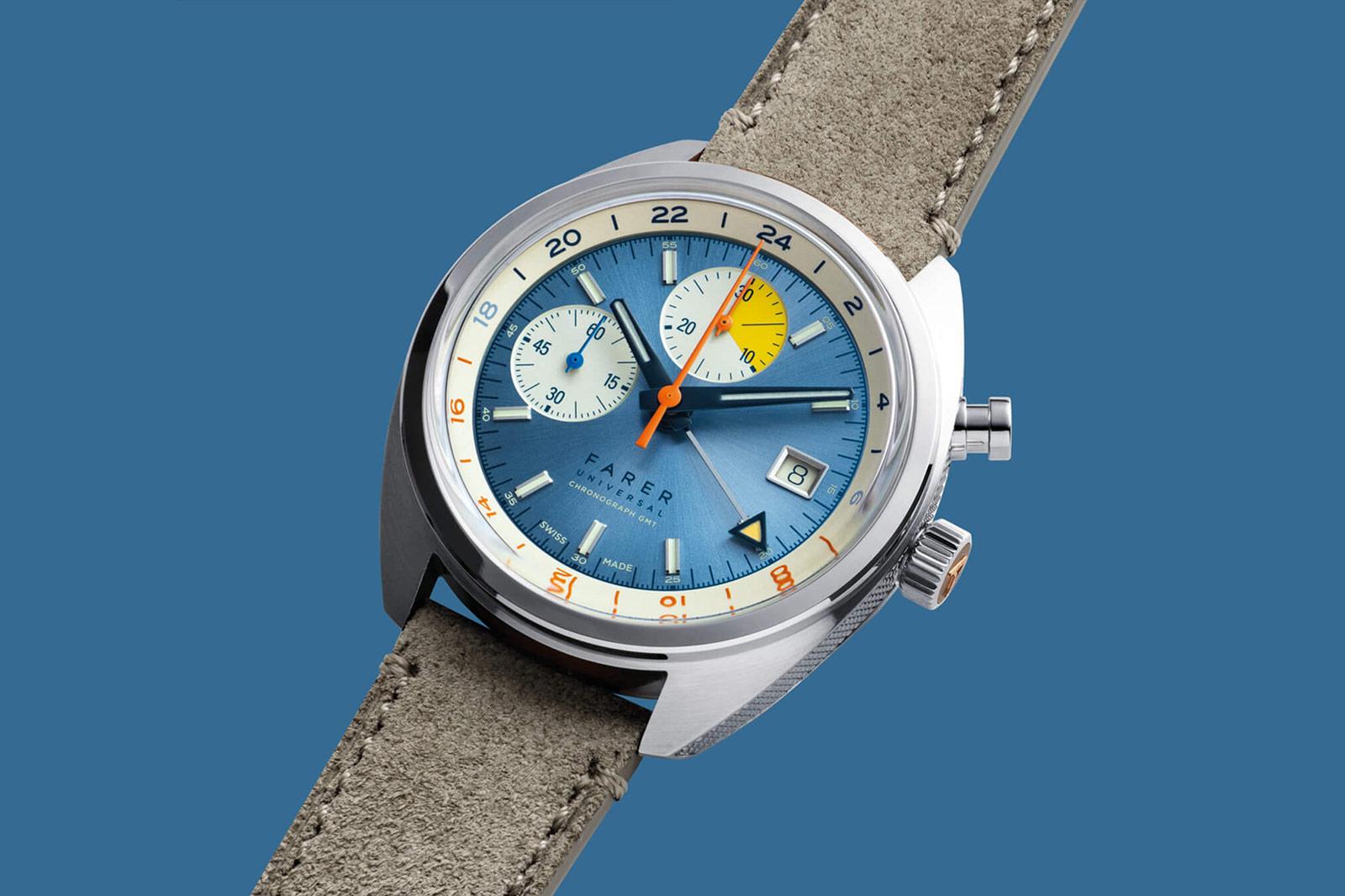
There are a few traits that, over the past decade or so, have come to define British watchmaking. Visually, there’s often a penchant for colour, underpinned by a distinctly vintage flair. There’s an emphasis on accessibility, allowing even new collectors to get a cool, automatic watch on their wrists and, finally, a playful design counterpoint to the staider Swiss watchmakers. And if there’s one watchmaker that embodies that reputational trifecta, it’s Farer.
Farer wasn’t started because their founder wanted to recreate their grandfather’s long-lost Rolex or had a driving urge to build a watch that nobody has ever built before. Founder Paul Sweetenham was far more pragmatic than that. He wanted to create a direct-to- consumer brand, challenging himself to do so as quickly as possible and, having previously worked selling colourful Swatch and TAG Heuer F1 timepieces, saw watches as the place he could do that.

Paul Sweetenham, founder of Farer
That might sound a little unromantic as origin stories go, but I’d argue that it’s simply honest. Very few entrepreneurs start a watch brand unless they think it’ll make money, no matter what they might say in their advertising spiel. I’d also argue that coming to watches from the outside – rather than as a collector – has its benefits. “Our approach is different”, explains Paul. “Everyone says that, obviously, but we’re not watch people coming to design; we’re design people coming to watches.”
In an industry where function is often more important than form, that’s a refreshing twist on the paradigm. Rather than take, say, a dive watch, look at its pure functionality and build out from there, you limit yourself. Instead, Farer takes a design concept they want to achieve and ask, what suits that concept?
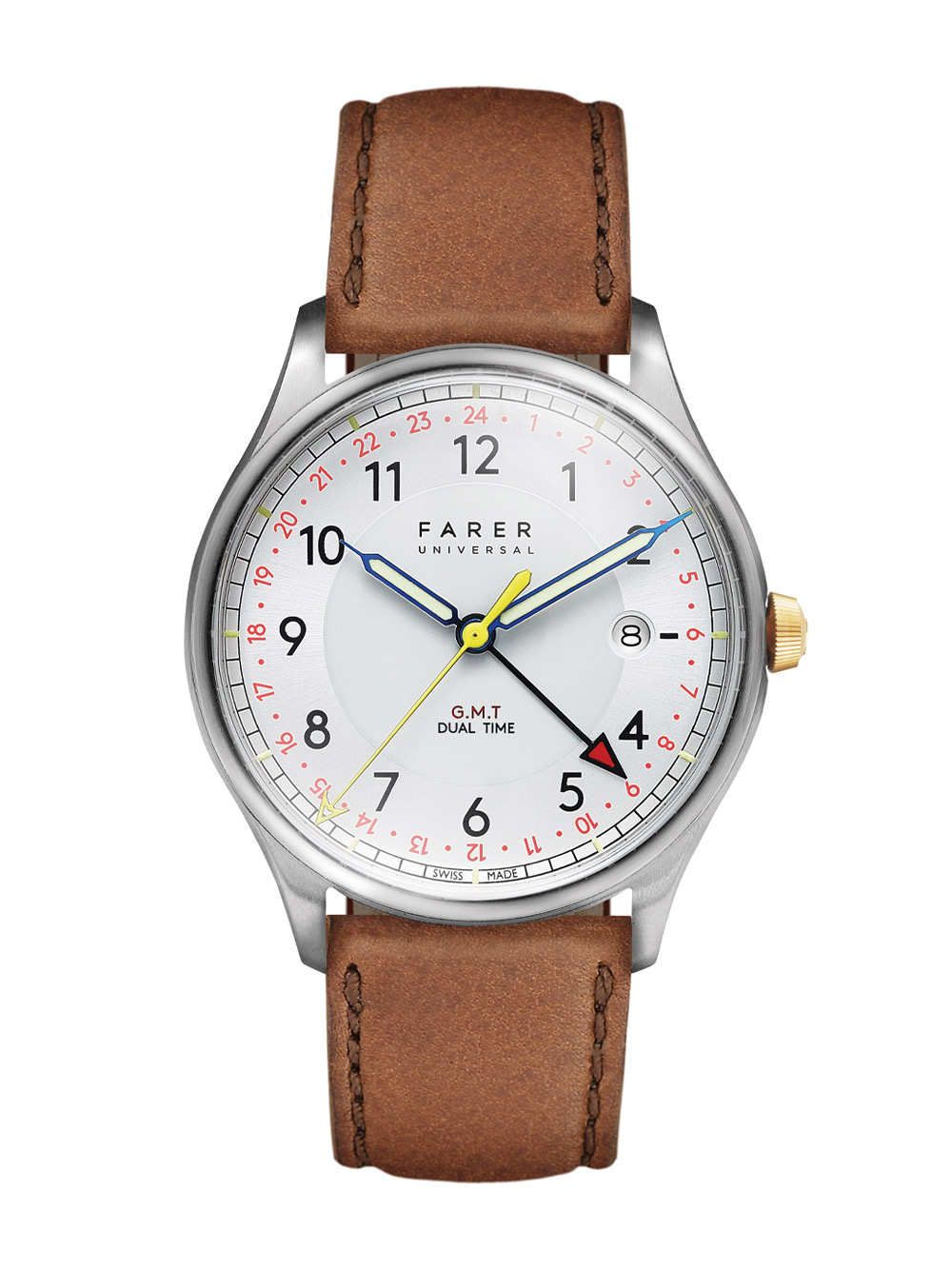
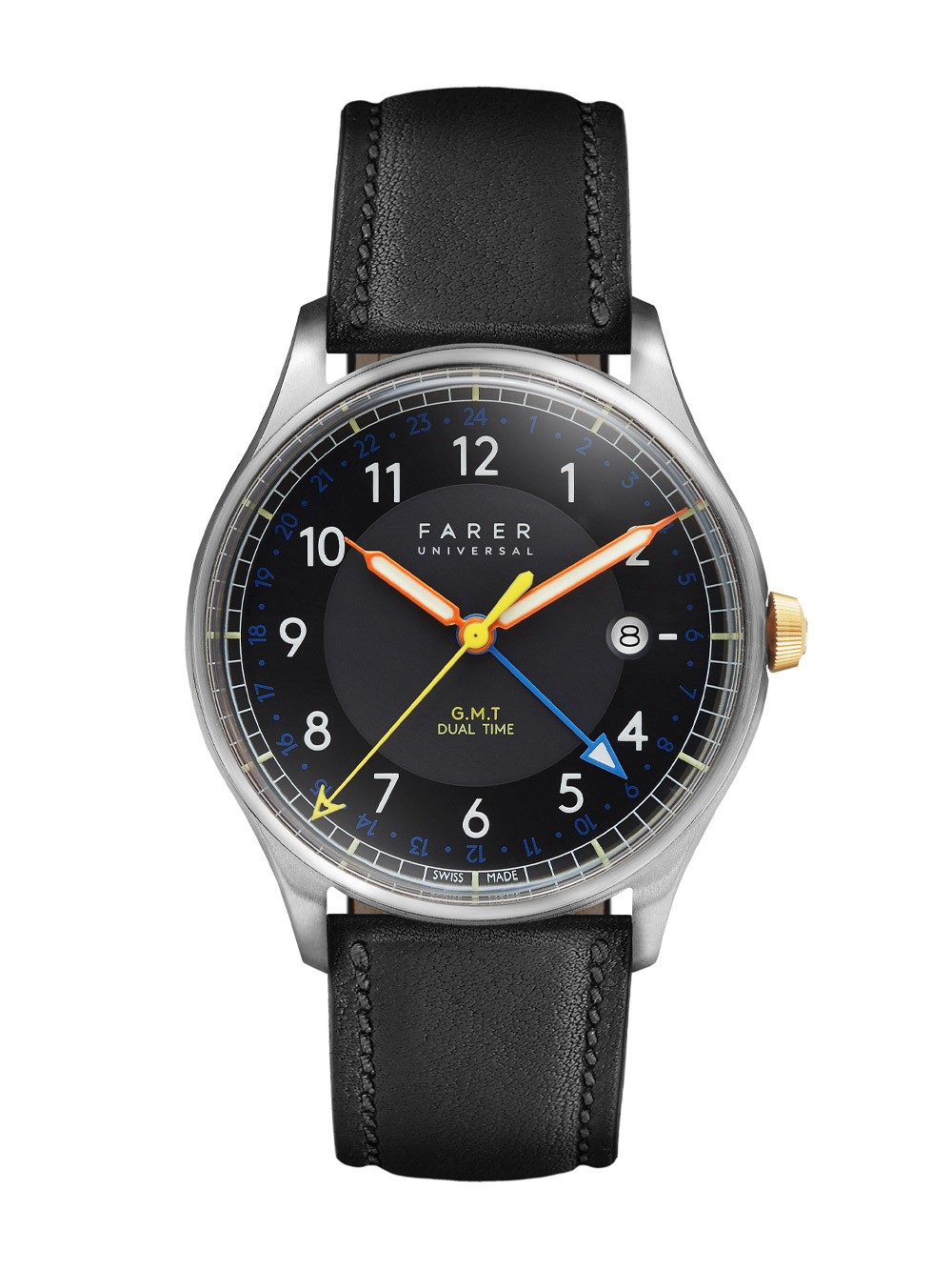
Farer launched their brand with two quartz watches; Bernato and Carter GMT (2015)
Initially it was an idea funnelled, like many a fledgling watch brand, into quartz pieces. It makes sense. Quartz is cheaper than mechanical so, if you’re looking for a proof of concept, that’s the best way to go – and Farer’s in good, British company in that regard, too. So, while they were uninspired mechanically, those initial pieces, launched in 2015, needed to be eye-catching. And they were, utilising flashes of bold colours against white and black dials. There was a lot going on and it all worked flawlessly.
The quirky, colourful take on halcyon watch design preceded the wave of vintage flavours that followed them. In context, Baltic, who are often credited with pushing that archival wave in the independent space, was founded a year later. Thanks to their quartz movements, that level of colourful fun was also incredibly accessible, showcasing an emphasis on value for money that would become part of Farer’s core ethos.
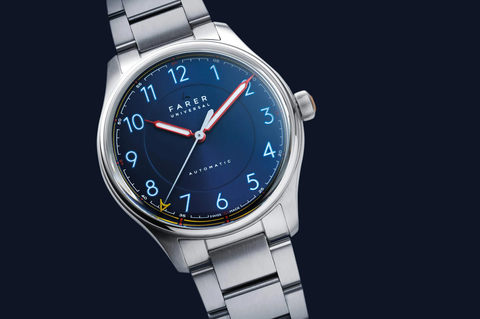
Farer Hopewell, part of Farer’s first collection of automatic watches (2016)
Like we always say however, one watch does not a brand make, a message that was explained to Paul in no uncertain terms. “When we were thinking about starting Farer, my friend at Roventa Henex took me down into their basement – nerve-racking from a Swiss ex-military man. He took me to cabinets full of files and when I asked what they were, he told me, ‘all the brands that built one watch with us and disappeared’. I was determined we wouldn’t be one of them.”
It was a year later, in 2016, that Farer moved to automatic with the elegant Hopewell, Beagle, and Endurance automatic, three-hand watches. In blues and whites with hints of bright red and green, they were full of what would become Farer character, particularly as all three had very different dials, rather than a simple palette swap.
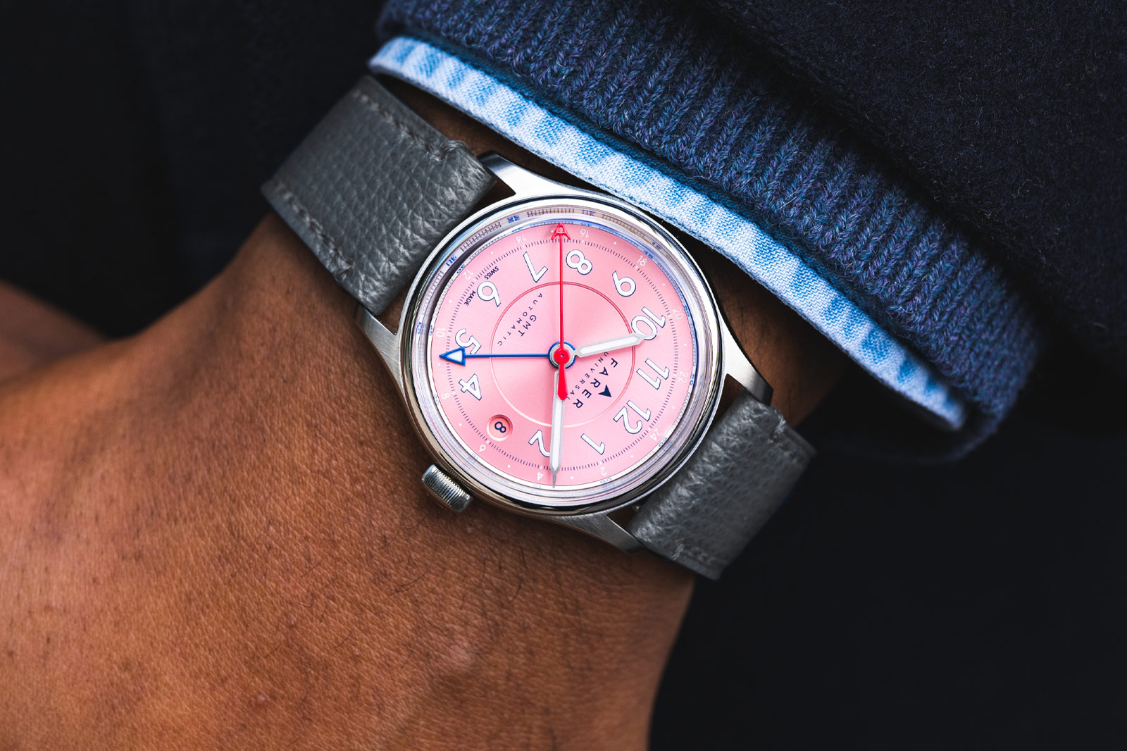
Farer Lander Kano GMT 36mm (2023), based on the brand’s earliest automatic watches, the Lander (2017)
Today, that’s one thing you can always bank on Farer for. When they release a new timepiece, it’s always more than a simple change of colour here and there. Each dial variation has a completely different character, something that comes directly from their unique mix of design sensibilities and practicalities.
“We take colourways and design elements from everywhere but the watch industry”, explains Paul. “We’ll look at old car catalogues and colour charts to get inspiration, mixing them with halcyon design elements we love – an index or numeral here, a handset there – to create three different watches, not just three versions of one watch. Those differences also mean that we often have guys that buy two or three from each collection.”
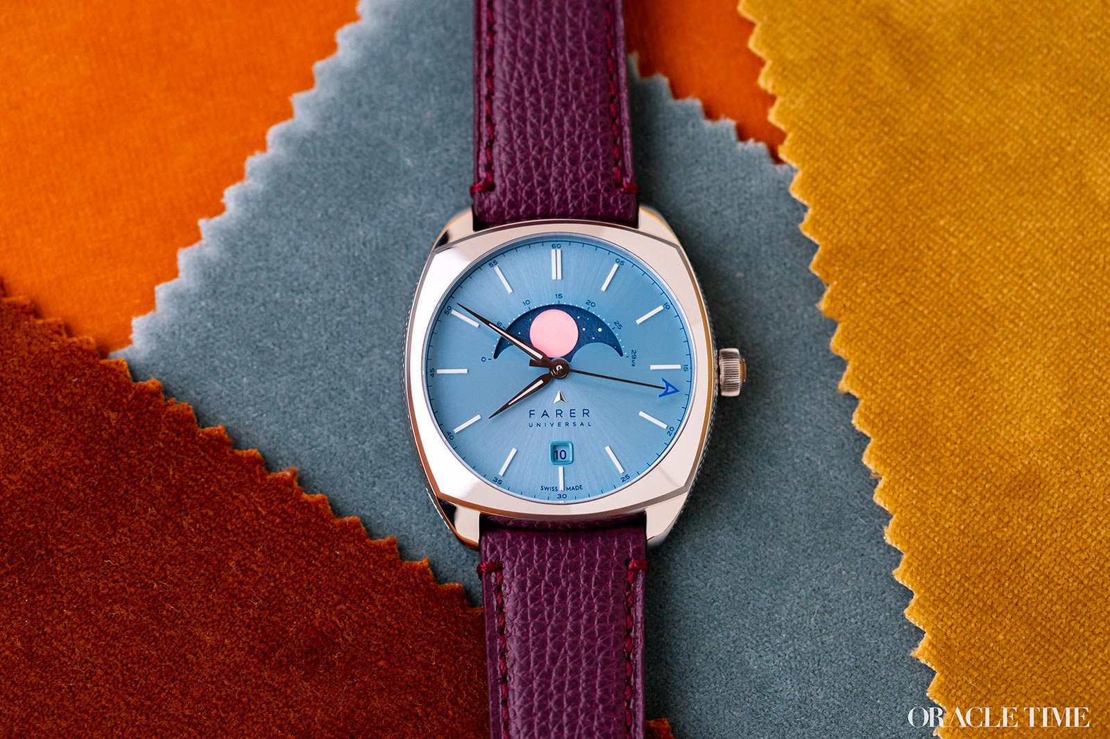
Farer Moonphase Burbidge (2023)
For some brands, one person buying two or three of your new release might seem fantastical, but Farer have found it par for the course these days. Their capsule drops regularly sell out in weeks at most, and the appeal is obvious. Not only are the designs different enough that each feels like a completely different watch, but each is more competitively priced.
Farer’s initial vision of a direct-to-consumer brand wasn’t because they disliked retailers, but because it meant they could offer more value to the people buying their watches. That was first done with quartz, then with ETA automatics and now it’s done with Sellita movements and a never-say-no approach to design that is, I’m sure, a frustration to many of their Swiss suppliers.
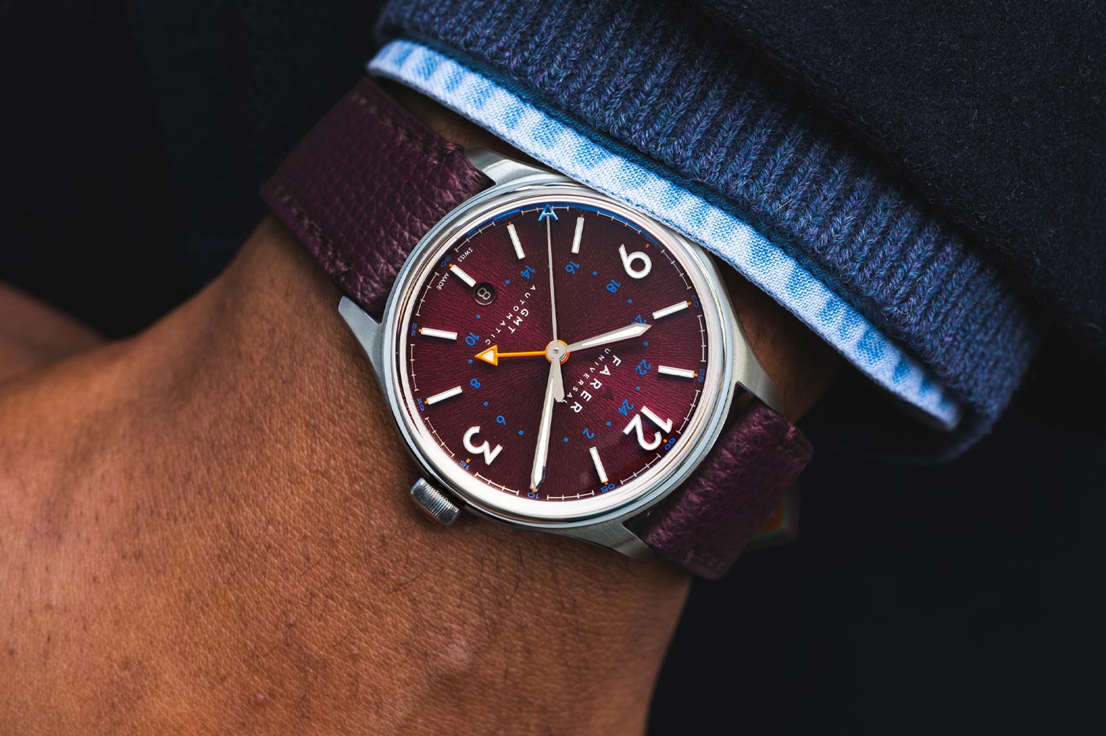
Farer Banzare GMT (2024)
“When we wanted to do purple lacquer, we were told just to give up and use clear lacquer over a purple dial,” says Paul of the regal Banzare limited edition. “We spoke to supplier after supplier who told us just to go with what everyone else did. But we didn’t want to do what everyone else did and we didn’t take no for an answer.”
Indeed, in many ways Farer are running counterculture to the wider watch industry – and I don’t just mean in terms of design. Transparency is a bit of a buzzword among independent brands, but few are as outspoken about the concept as Farer. They will happily tell you not just who makes their movements, but their cases, dials, straps, hands and lume. In an industry legendary for its obfuscation (to the point where in-house has lost a lot of meaning), that’s a refreshing take, and ties in nicely to Farer’s fairer pricing.
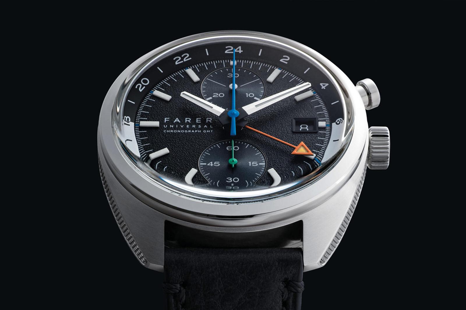
Farer Monopusher GMT Seagrave
Just take a look at their latest release, the Monopusher GMT. On paper, some collectors might balk at paying nearly £2,000 for a Sellita movement. That alone is a little bit painful when you examine just how solid Sellita movements are compared to even ETA, but in this case it’s a travesty. A chronograph GMT is a rare but immensely useful combination, and Sellita’s version is truly exceptional.
You might also notice that the dial has two variations that go beyond even Farer’s usual range of designs. One has bi-compax subdials at 12 and nine; one has those dials at 12 and six. That might seem like a small difference, but it means altering the architecture of the movement. One of the layouts involves more components and more jewels to make it work – but I’m not going to tell you which one. Like sizes, it should be a matter of taste rather than price as to which you prefer, hence both versions being priced exactly the same.
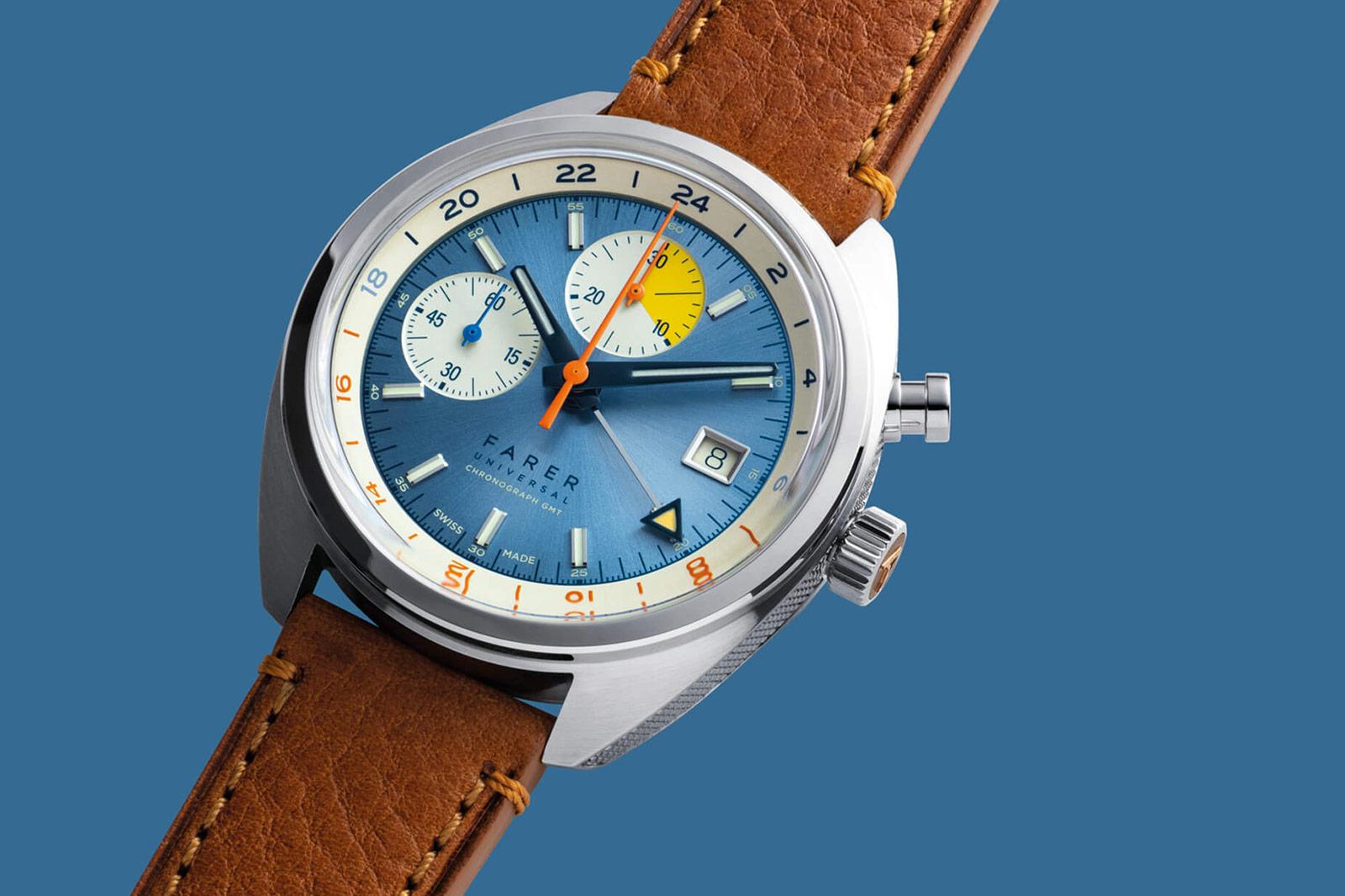
Farer Monopusher GMT Cobb
This way of playing with the movement’s very architecture illustrates Farer’s dedication to offering something different and something of genuine value. Sure, they bring people into the fold with funky designs you won’t find elsewhere, but while they may start from a design-led drawing board, there’s plenty of substance under the surface. In short, come for the colours, stay for the chronometry.
More details at Farer.


Tried the monopusher at Watchit, just superb