While today’s article focusses on the Rado True Square Automatic Skeleton Blue, if you took at Rado’s direction over the past few years, you’d be forgiven for assuming that they produced one watch in infinite variations of the Captain Cook. Ever since they relaunched the retro diver, they’ve been riffing on the theme with different colours, materials and levels of skeletonisation, which is a shame, not because there’s anything wrong with the flagship watch, but because it squeezes out some of the cooler, quirkier facets of the brand.

Indeed, while the Captain Cook was super successful in the 1960s, Rado’s history has been defined not by diving, but by sleek futurism and ceramic, the kind of pieces that still feel cutting-edge in design today. That’s especially true of the Ceramica from the 1990s, Rado’s first square, full ceramic watch – case, crown and bracelet all.
As far as I’m concerned, the Ceramica is a definitive ‘90s model and, while I wait with bated breath for some kind of reissue (if it worked for Hamilton’s PRX…), the next best thing is the model’s updated sibling, the True Square. Sure, the True Square’s perhaps a more traditional watch, with a bracelet narrower than the case, but it still has the same sleek, smooth, ceramic look – and the latest True Square Skeleton Blue amps up that funky futurism to a new level.
Rado love ceramic; it’s part of their DNA more than anyone save, perhaps, IWC. But this year they’ve been trying their hand at coloured ceramic, particularly blue. It’s something they leveraged previously on our cover-starring Captain Cook x England Cricket watch, which used a combination of blue and white. Personally, I prefer it here.
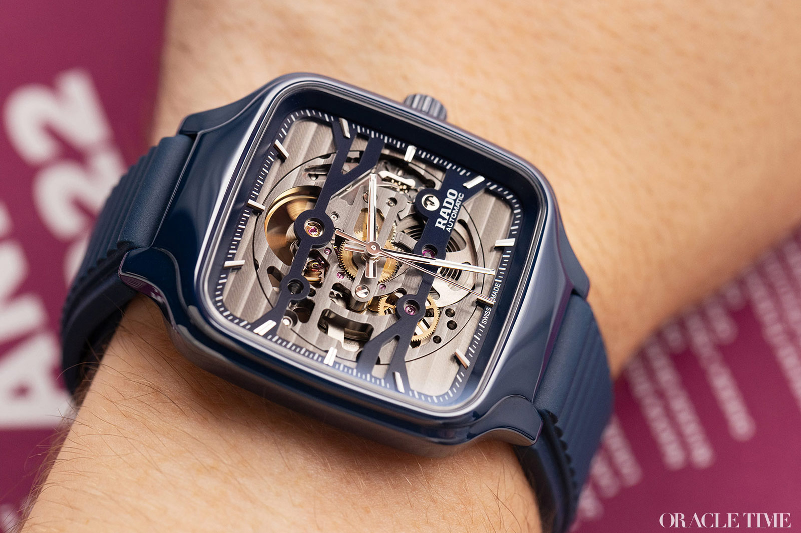
The smooth, rounded shoulders where the strap meets the case, the almost glossy sheen and the tactile bezel all look great in this specific shade of dark blue, less aesthetically plasticky than you sometimes get with something like white. It’s not the first time the True Square’s been released in coloured ceramic – as in, not white or black – as there have been both turquoise and peach versions in the past. But I would argue it’s the most wearable colour. It is very glossy, which I imagine would put some people off and while I’d prefer a matte finish if only to hide fingerprints, it does add to the True Square’s space-age sheen.
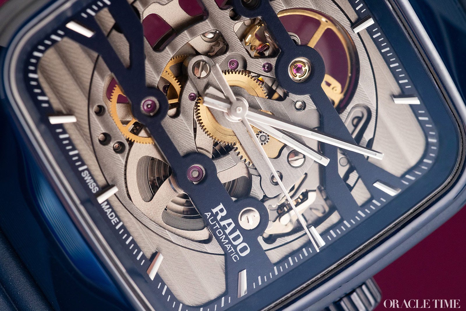
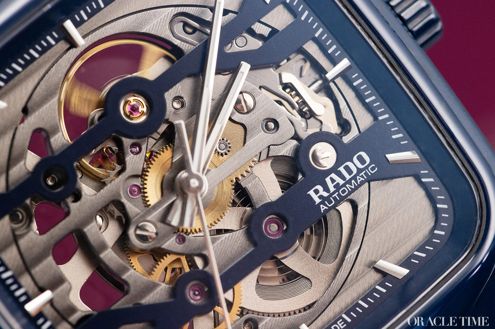
That ultra-modern look is emphasised by the dial too – or more accurately, lack thereof. Other than the two horizontal blue bridges dividing the open space into three, the entire movement is open. Rather than leave it as is, Rado has given the movement plenty of Côtes de Genève, making a feature of the visible metal.
Despite being technically a skeleton watch, there’s not actually many places you can see through the watch in its entirety, which I’m completely on board with. I’ve gone on (broken) record explaining that I wear a watch to hide my wrists, not stare at my arm hair, but I do like the intensely mechanical look of a clearly visible movement. This is the best of both worlds, especially when the metalwork you can see is tastefully finished.
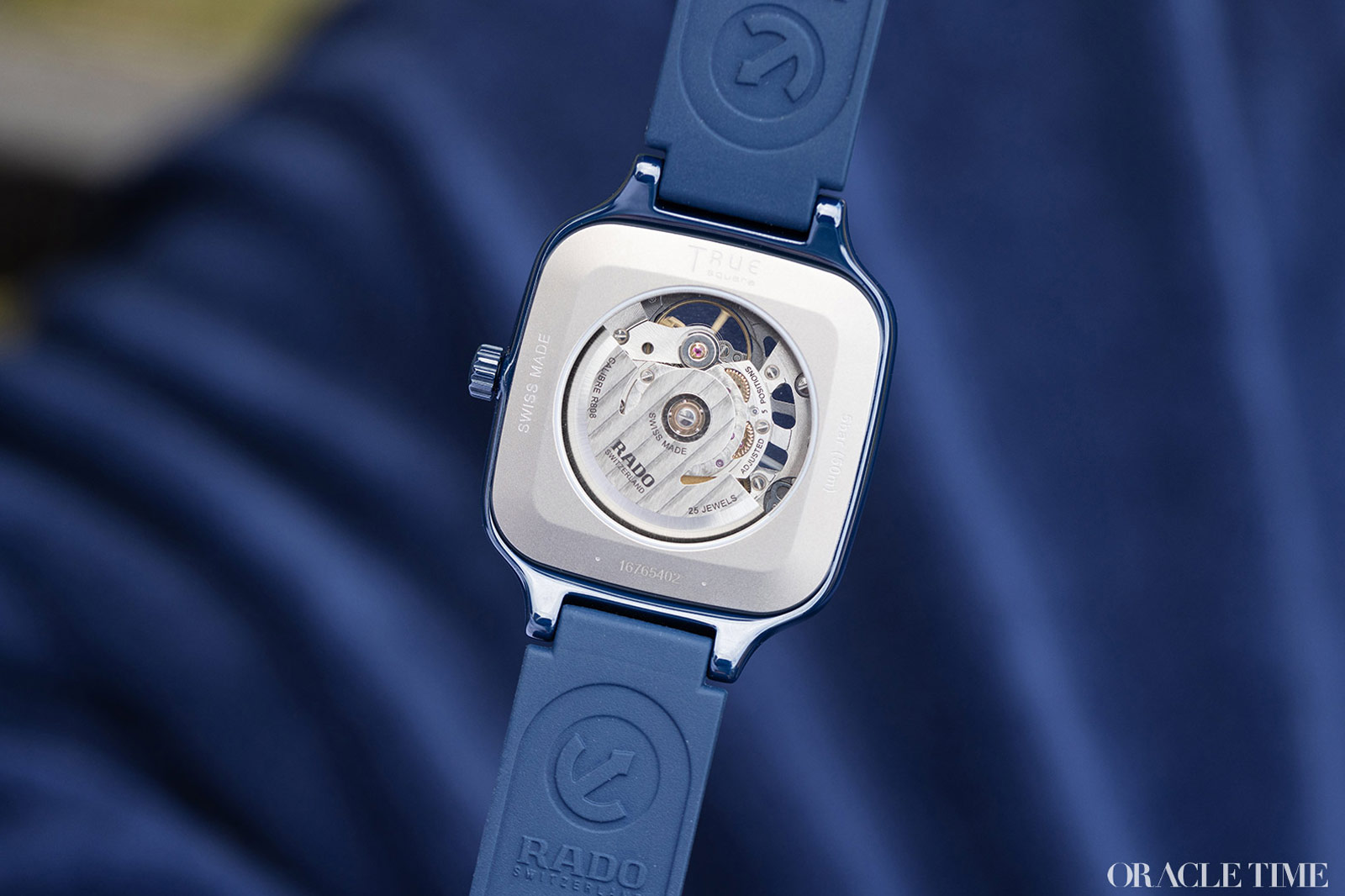
Said movement is the R808, the same calibre as in the Captain Cook skeleton and pretty much any modern skeleton Rado. Said movement has a Nivachron hairspring for anti- magnetic properties and a power reserve of 80 hours which, given Rado’s a Swatch Group brand, we can assume that this is a Powermatic 80 by any other name, just much better finished.
Other than the colour, the most unusual thing about the new True Square is the collection’s first strap. The model always came on a bracelet before and for good reason, tracing its lineage as it does back to the Ceramica. It’s also a bit of a flex, as making a full ceramic bracelet isn’t as easy as it sounds, and it sounds pretty tough. Change is good though and the comfy, flexible rubber as an alternative to a full, polished bracelet makes the True Square immeasurably more wearable in a daily context. I’m not quite sure why it’s taken this long to make it a reality.

That wearability is the crux here. The True Square and the Ceramica before it have always been just the right edge of aesthetically cutting-edge, perennially new and shiny, and using ceramic for its looks perhaps more than the practicality other watchmakers love it for. But the combination of that flattering blue and the rubber strap pull back a little from that look, less futuristic, more forward- thinking and a lot more wearable – especially with this much horological tech at this price point.
Yes, there are a couple of issues. A mere 50m water resistance is less than I’d like for a daily wearer and I do find it a bit too glossy. But while it’s still not for everyone, it’s for many more potential collectors than ever before. Including me. At least, if they did a matte version.
Price and Specs:
More details at Rado.

