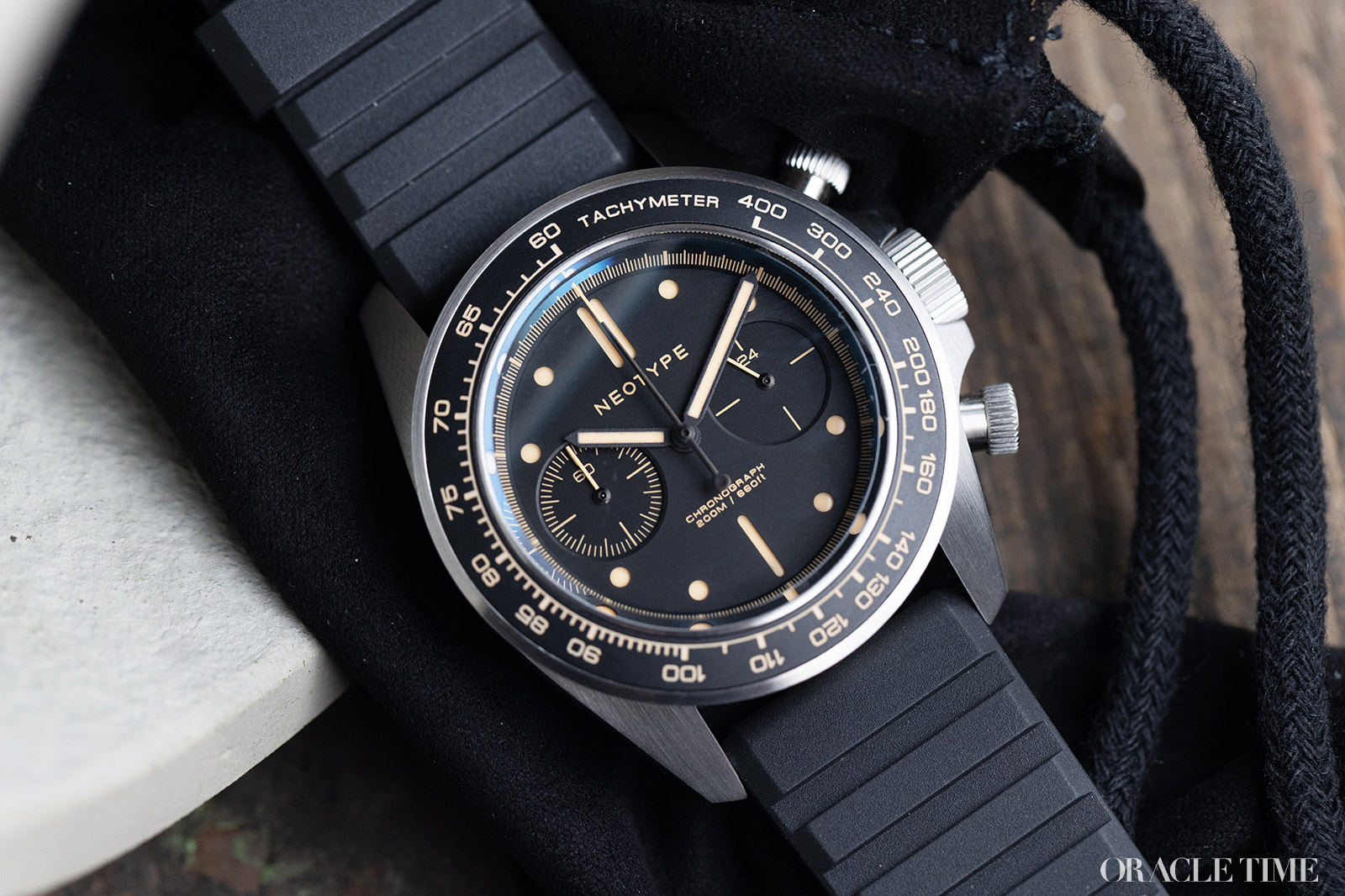
There will always be room in my heart for accessible chronographs, sporty timepieces that are practical, fun to wear and priced in such a way that you might actually consider wearing them to your local track day. Such is the case with the Neotype LM02 Type C limited edition that was launched earlier this year. I’ve taken two of them for a test drive, the retro-styled LM02C1A and the more urban LM02C2N.
On the wrist both versions wear very well. They measure 41mm in diameter with a thickness of approximately 14mm from caseback to crystal top. On paper those are fairly substantial dimensions but actually I don’t find it overbearing at all. The gentle slope of the tachymeter bezel and angled lugs make it feel slimmer than it actually is. This coming from someone who owns almost exclusively sub-40mm watches.
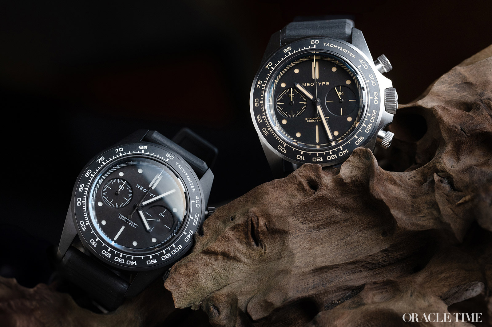
The primary difference between the two versions of the LM02 Type C I’ve been wearing is the finish on the case. The LM02C1A has exposed steel with delicately brushed surfaces while the LM02C2N has a sandblasted black PVD coating. They then both have black ceramic insert tachymeter bezels. Of the two, the steel edition is more striking as it’s literally the flashier one compared to the matte finish of the black. Although that does work in the black edition’s favour in terms of being a stealthier option.
Another notable difference is that the steel edition has old radium style lume in beige with the same colour being used across the subdials, tachymeter and chronograph seconds scale. In contrast the black PVD’s markings are stark white. It’s worth noting that there are two additional references that I haven’t been hands-on with that flip those colours – steel with white details and PVD with old radium details.
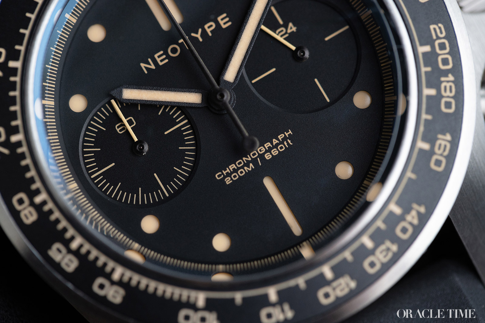
Focussing in on the dials, they’re sandwich displays with bicompax subdials. At 9 o’clock is a chronograph 60-minute scale and at 3 o’clock is a 24-hour display. Whenever I see a 24-hour display on a 12-hour watch, I do wonder what the point is. It more serves as a day-night indicator than a time display and a second time zone would offer much more utility. However, that’s a very minor point in the grand scheme of things.
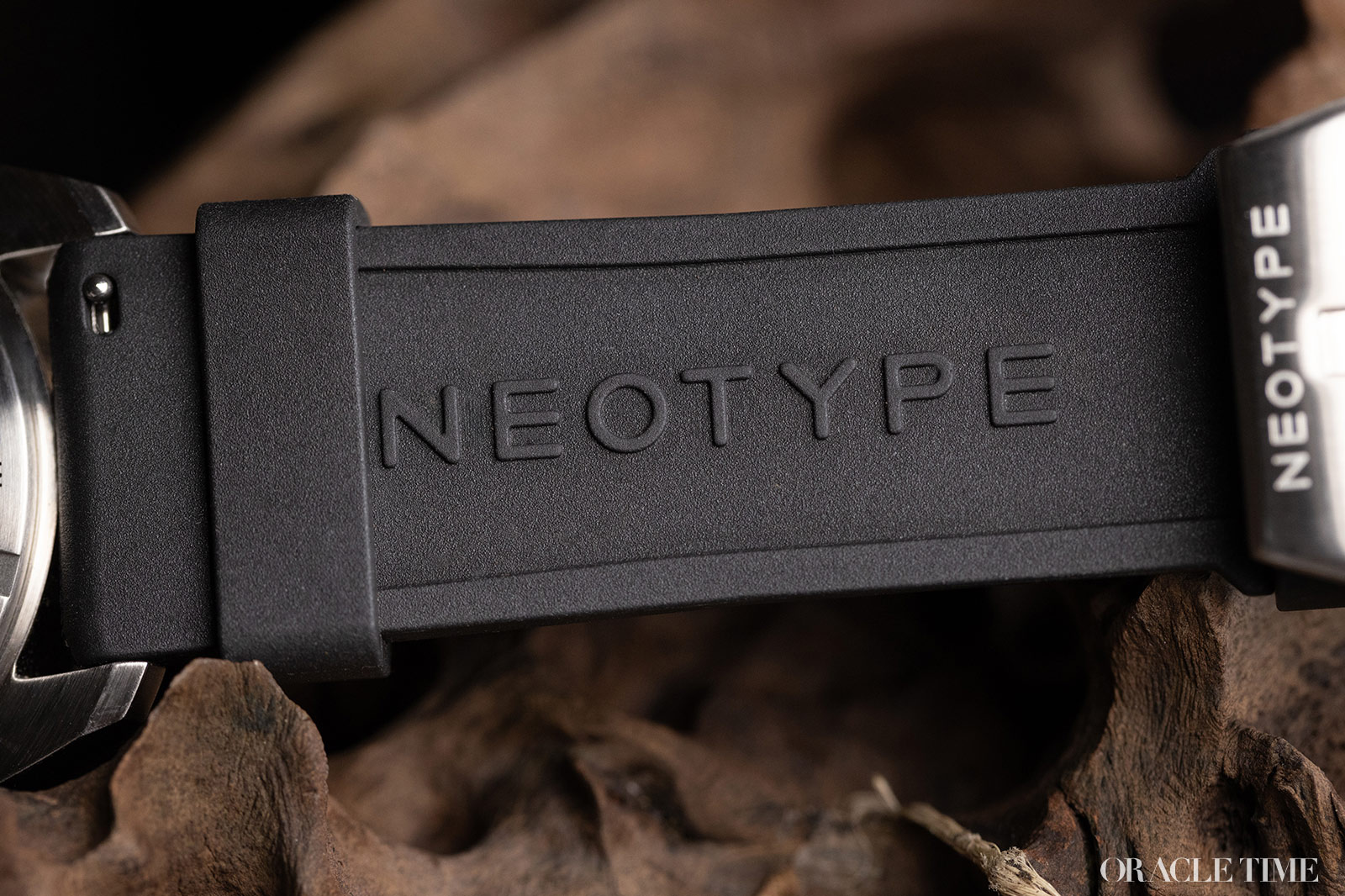
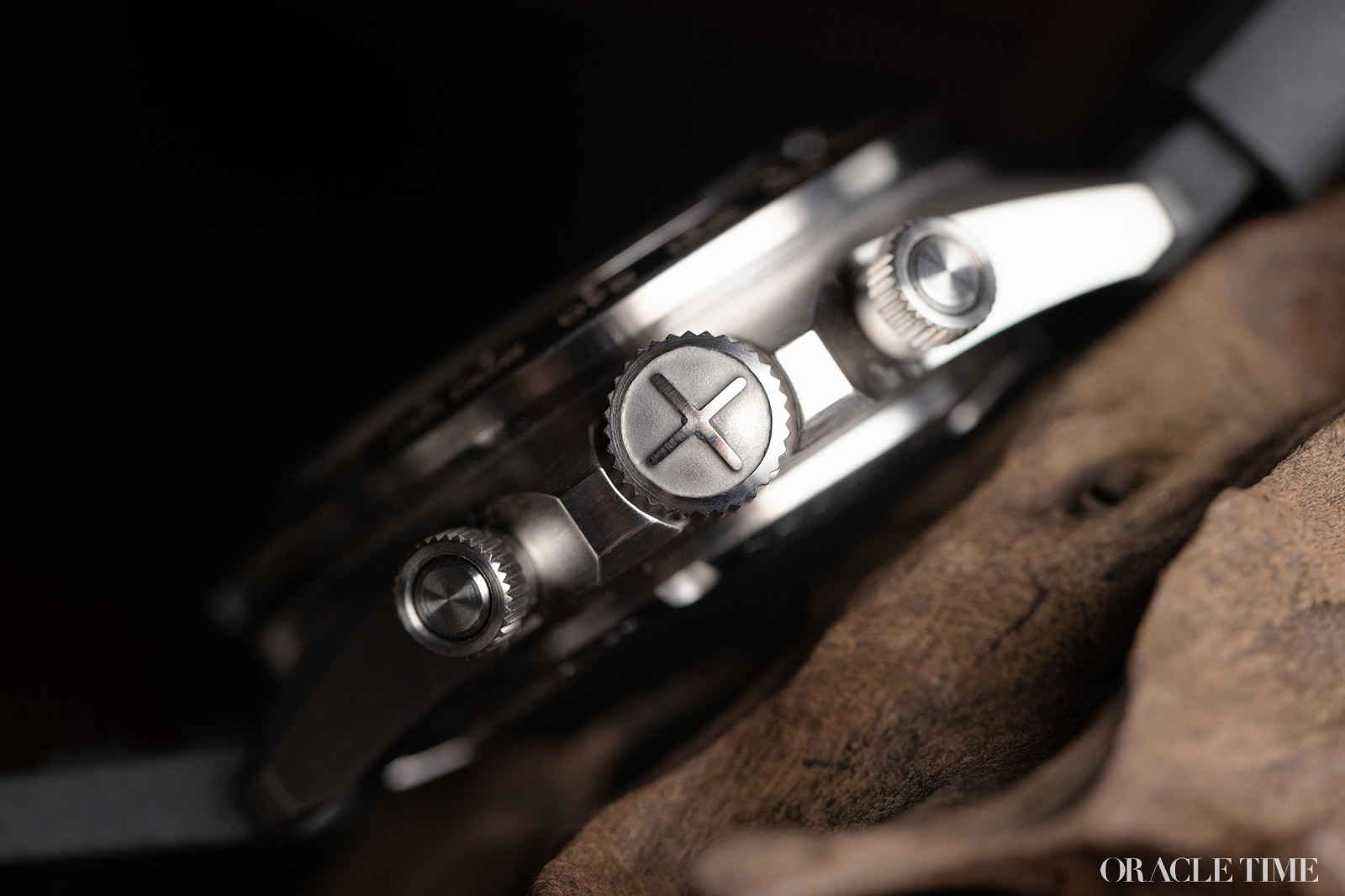
The chronograph function itself is controlled by two screw-down pushers. Typically screw-down elements are associated with dive watches but watches like the Rolex Daytona popularised their use on racing chronographs. I suppose it’s so you don’t accidentally start or stop the timing. Their use is actually pretty rare, especially at accessible price point, but I like them. They give a nice tactile element to the watch, making up for the lack of a rotating bezel.
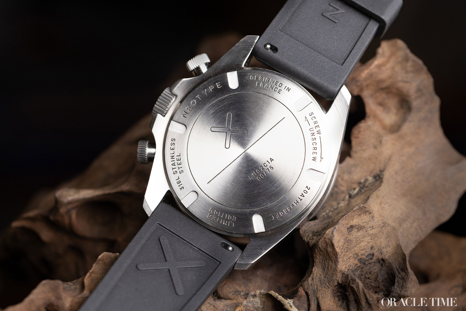
Beneath the solid caseback of the Neotype LM02 Type C is the Seiko VK64 meca-quartz chronograph. Meca-quartz is a hybrid calibre that combines the reliability of a quartz regulator with the smooth feel of a mechanical chronograph. I would prefer it to be fully mechanical but evidently Neotype didn’t want to deviate too significantly from their previous models in terms of price and an auto chrono could add a hefty chunk of change.
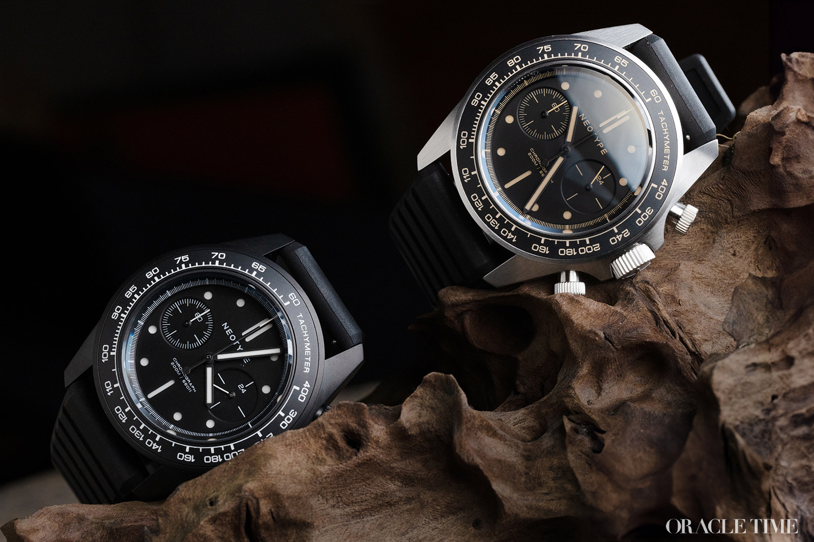
All four versions of the watch, including the two I have here, are limited to 75 pieces each. The LM02C1A is priced at £449 while the LM02C2N is £485. So, after test driving both, which would I add to my garage? It has to be the retro-slanted LM02C1A. The combination of the steel case and beige numerals give it a vintage appeal that gives it more character compared to the modern, urban PVD edition.
Price and Specs:
More details at Neotype.



I looked through this article, really enjoying the monochrome looks of the watch. Unfortunately I’m not a fan of beige lume. What’s that you say? There’s a white lume version in the sandwich dial format? I’m definitely in, wow this thing looms incredible!
Hang on a minute though, that’s not an hour totaliser subdial, that’s an utterly pointless 24h subdial. Dang, killed any interest.
For the same reason that I love the looks of several Seiko Chronos, but could never buy one, I just hate the waste of space and time that is a slaved 24h dial. I know Breguet are guilty of this too and it doesn’t make it any easier to get over.
Is it just me or does it look disturbingly similar to the Unimatic U3??